| View previous topic :: View next topic |
| What is your favorite art for the back of a shirt? |
| Backglass art |
|
16% |
[ 4 ] |
| Side art centered (more or less) on planet |
|
25% |
[ 6 ] |
| Side art back portion, planet on left or right |
|
4% |
[ 1 ] |
| Playfield (lower 2/3rds, lower third, or middle third) |
|
0% |
[ 0 ] |
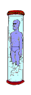
| Tubedancer(s) |
|
25% |
[ 6 ] |
| Planet logo, red or blue |
|
8% |
[ 2 ] |
| Capcom logo |
|
8% |
[ 2 ] |
| Arpon Waitress |
|
4% |
[ 1 ] |
| Playfield Waitress or Whip? girl (from cabinet front) |
|
4% |
[ 1 ] |
| Other/Combo see post |
|
4% |
[ 1 ] |
|
| Total Votes : 24 |
|
| Author |
Message |
BBB94

Joined: 02 Aug 2005
Posts: 407
Location: WI, USA
|
 Posted: Wed Jan 11, 2006 10:56 pm Post subject: BBB Merchandise Poll #5 Favorite Shirt Art, Back Posted: Wed Jan 11, 2006 10:56 pm Post subject: BBB Merchandise Poll #5 Favorite Shirt Art, Back |
 |
|
I dont think the front portion of the side art would work well because it would be too oddly cropped, so I left the following as write in candidates in case anyone disagrees with me:
Side art planet on left (front portion of left side)
Side art planet on right (front portion of left side)
If there is a landslide, I may do a 2nd favorite back art poll to ferret out the best options for additional shirts.
For better or worse the options would have been more specific if there was not a 10 choice limit for polls.
| Kerry Richard: in Poll #6 wrote: | | Any chance these images can be a thumbnail next to the vote options? |
Backglass  Side art L center Side art L center 
Side art L rear  Side art L front Side art L front 
Tubedancer  Whip? girl Whip? girl 
Apron Waitress  PF Waitress PF Waitress 
Planet logo, red  Planet logo, blue Planet logo, blue 
Playfield middle  Playfield bottom Playfield bottom 
Anyone got a good pic of the right side of the cabinet, Pf Waitress, or Whip girl?
Last edited by BBB94 on Tue Jan 17, 2006 4:29 pm; edited 3 times in total |
|
| Back to top |
|
 |
blubboman
Joined: 02 Aug 2005
Posts: 69
Location: Lebanon, In
|
| Posted: Thu Jan 12, 2006 5:36 pm Post subject: Playfield waitress |
|
|
Like my other post, the playfield waitress has it all!
A tray of wacky space drinks
A slinky 'Saturn ring' boob dress
Blue skin
Orange mohawk hair
Tubes for ears (uh, not sure what those are for . .)
She looks good on the side cabinet also. |
|
| Back to top |
|
|
BBB94
Joined: 02 Aug 2005
Posts: 407
Location: WI, USA
|
| Posted: Mon Jan 16, 2006 1:31 pm Post subject: Re: Playfield waitress |
|
|
| blubboman wrote: | | Like my other post, the playfield waitress has it all! |
Does anyone have a guality, well lit, straight down (not angled), pic of that section of the playfield? I haven't come across any to play with. TIF or PNG preferred, high quality JPG okay. |
|
| Back to top |
|
|
BBB94
Joined: 02 Aug 2005
Posts: 407
Location: WI, USA
|
| Posted: Tue Jan 17, 2006 4:31 pm Post subject: |
|
|
| I added the thumbnails to my original post. |
|
| Back to top |
|
|
BBB94
Joined: 02 Aug 2005
Posts: 407
Location: WI, USA
|
| Posted: Tue Jan 17, 2006 5:00 pm Post subject: |
|
|
Does anyone know how many screens are required to print the backglass?
Am I correct that it takes 7 screens for the side art? |
|
| Back to top |
|
|
Swann

Joined: 02 Aug 2005
Posts: 108
Location: Stockholm, Sweden
|
| Posted: Wed Jan 18, 2006 12:47 am Post subject: |
|
|
Yes, I think 7 screens should do it in regards to the sideart, maybe 8 (look on the eye of the creature with the long neck top right, it seems like another shade of green)
1 Yellow
2 Red
3 Black
4 Light Blue
5 Light Green
6 Purple
7 White
8 (Medium Green)
I'd have to agree too that the playfield waitress is nice (it's the same as on the side-art!). So definitly carefully edited side-art would be truly great as back-print! (that is shouldn't look like some one just took the side-print and used it, the edges should be following the figures and not the cabinett-side size.)
_________________
BBB #79 has arrived here in Stockholm, Sweden! |
|
| Back to top |
|
|
alienagent
Joined: 02 Aug 2005
Posts: 14
Location: Pickering, On
|
| Posted: Wed Jan 18, 2006 8:18 pm Post subject: Over painted shirts |
|
|
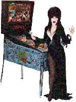
I think we would find that robert could probably come up with much better designs for the shirts, His elvira shirt looks really good, not lacking in graphics but not too busy either.
It seems like we are heading in the direction of covering as much of the shirt as possible with paint, and that could look really tacky 
Im looking for something I can wear without looking like a billboard. |
|
| Back to top |
|
|
robertwinter
Site Admin
Joined: 02 Aug 2005
Posts: 298
Location: Los Angeles
|
| Posted: Wed Jan 18, 2006 10:50 pm Post subject: Re: Over painted shirts |
|
|
| alienagent wrote: | I think we would find that robert could probably come up with much better designs for the shirts, His elvira shirt looks really good, not lacking in graphics but not too busy either.
It seems like we are heading in the direction of covering as much of the shirt as possible with paint, and that could look really tacky
Im looking for something I can wear without looking like a billboard. |
I can't take credit for the design of that shirt although I did do a run of them in cooperation with Jim at PinGame Journal.
I agree about not making the shirt too busy. That's why I like the concept of a small BBB planet on the front and the tube dancer on the back. The other reason I like the choices is because of the low number of colors required to pull it off. The BBB planet is only three colors and the tube dancer is about 4 colors.
The sideart or backglass art is just too complex to be on a shirt. Too much going on and too crowded. It's great if you've got time to stare at it and discover all the detail, but the normal person is probably only going to glance at it for a second or two.
I dislike the idea of any wording added especially if it's something corny or suggestive. A shirt should be something that *everyone* could feel comfortable wearing. Sometimes simplicity is good.
_________________
Robert
-----
http://www.robertwinter.com
BBB #74 |
|
| Back to top |
|
|
Kerry Richard
Joined: 02 Aug 2005
Posts: 101
|
| Posted: Wed Jan 18, 2006 11:11 pm Post subject: |
|
|
Thanks for the thumb nails...They're very helpful to me and I'm sure to others.
Thanks again!
Kerry Richard #111 |
|
| Back to top |
|
|
Swann
Joined: 02 Aug 2005
Posts: 108
Location: Stockholm, Sweden
|
| Posted: Thu Jan 19, 2006 12:50 am Post subject: |
|
|
I agree with that too busy print becomes messy, but I also still think that the Side-art of the cab is truly great. With the right coloring (UV-reactive) it would turn out to a truly amazing print! (and yes, with the right art editing too, wouldn't want it to be a square covering the shirt, it should be a suitable image.)
By the way, Robert, only a second or two? Does the ball drain that fast when you're playing?  Don't you play for longer periods with your back towards the audience? Don't you play for longer periods with your back towards the audience? 
Yes, wording makes it too much... it's better to have a print that makes people interested and wants to know more (just art) then one that says it all... and yes, wording is not suitable to wear by everybody.
In regards to the Tube dancer, well why don't we have three prints, you can then get them in every possible variation that you want, that would satisify most people I guess;
1. Front: Tube - Back: Sideart
2. Front: Tube - Back: nothing
3. Front: BBB logo (small top right) - Back: Tube
4. Front: BBB logo (small top right) - Back: Sideart
5. Front: BBB logo (small top right) - Back: nothing
6. Front: Sideart - Back: Tube
7. Front: Sideart - Back: nothing
Personally I think several of the options doesn't really work, and would go for getting some T-shirts of 3 & 4. But the taste is like your a*s, twofolded (this is a Swedish saying, guess it doesn't exist in US..or???), and some of the others someone else might like more.
Sure I would also think it to be truly great with a fourth print available too, one that says "Capcom". Would be cool with a shirt that just says Capcom (small top right) and on the back Tube or sideart.
I believe for the printer it's not such a deal to have many prints to choose between, the big cost is to develop them.
_________________
BBB #79 has arrived here in Stockholm, Sweden! |
|
| Back to top |
|
|
BBB94
Joined: 02 Aug 2005
Posts: 407
Location: WI, USA
|
| Posted: Thu Jan 19, 2006 3:43 pm Post subject: |
|
|
Robert, Swann - I agree that (most of?) the final ideas need to be less busy. The more I contemplate things the more I like the idea of having the BBB logo on only one side (whether solo or as part of the BG or side art) in line with your TD/side art & logo/TD suggestions. 1) it is less repetitive, 2) it identifies the art for the uninitiated. I think the backglass would be difficult and perhaps expensive, and maybe the side art done right would be more impressive on a shirt anyways.
I also agree that the worded shirts aren't that compelling. Although I think the Capcom logo or name or the word pinball somewhere would help prevent the shirt from being mistaken as memorabilia for the chain of real bars. I just came up with an idea for this and will post it in the shirt front section when the image gets uploaded.
Ive been working on (what I think are) some pretty good concept images for the side art and Tubedancer that I will post soon. It occurred to me that we can save money on the side art if the red and yellow are replaced with blue and green like the apron logo. Maybe its not worth it to save a dollar or two per shirt, but we can vote on it at some point. |
|
| Back to top |
|
|
|

