| View previous topic :: View next topic |
| What is your favorite art for the sleeves or other spots of a shirt? |
| Planet logo, red or blue |
|
30% |
[ 7 ] |
| Tubedancer(s) |
|
30% |
[ 7 ] |
| Capcom logo |
|
21% |
[ 5 ] |
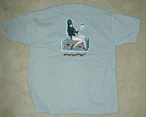
| Arpon Waitress |
|
0% |
[ 0 ] |
| Playfield Waitress |
|
4% |
[ 1 ] |
| Whip? girl (from cabinet front) |
|
4% |
[ 1 ] |
| Other see post |
|
8% |
[ 2 ] |
|
| Total Votes : 23 |
|
| Author |
Message |
BBB94

Joined: 02 Aug 2005
Posts: 407
Location: WI, USA
|
 Posted: Wed Jan 11, 2006 11:06 pm Post subject: BBB Merchandise Poll #7 Favorite Shirt Art, Sleeves etc. Posted: Wed Jan 11, 2006 11:06 pm Post subject: BBB Merchandise Poll #7 Favorite Shirt Art, Sleeves etc. |
 |
|
Also, where else can we put art besides the sleeves? I thought of the small of the back - for instance the side art high on the back in a typical location and maybe the Capcom logo just above the waist.
If there is a landslide, I may do a 2nd favorite sleeve art poll to ferret out the best options for additional shirts.
I voted for the Capcom logo under the assumption that most of the shirts will be short sleeve, but I really like the tubedancer idea for long sleeve shirts/sweatshirts.
| Kerry Richard: in Poll #6 wrote: | | Any chance these images can be a thumbnail next to the vote options? |
I just sent the files to RW, so it may take a bit for the pics to work.
Tubedancer  Whip? girl Whip? girl 
Apron Waitress  PF Waitress PF Waitress 
Planet logo, red  Planet logo, blue Planet logo, blue 
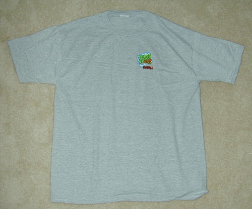
Capcom Logo 
Anyone got a good pic of the Pf Waitress or Whip girl?
Last edited by BBB94 on Tue Jan 17, 2006 4:37 pm; edited 4 times in total |
|
| Back to top |
|
 |
Swann

Joined: 02 Aug 2005
Posts: 108
Location: Stockholm, Sweden
|
| Posted: Thu Jan 12, 2006 12:27 am Post subject: |
|
|
...and now I've walked into the corner not beeing able to find my way out of it... (don't like to have the same logotype twice at the same time there's nothing more then the Capcom-logo that suits for the sleeve), so I had to select that one "again", even when I really don't want to see it twice... (should have read through all the poll's before selecting....)
_________________
BBB #79 has arrived here in Stockholm, Sweden! |
|
| Back to top |
|
|
robertwinter
Site Admin

Joined: 02 Aug 2005
Posts: 298
Location: Los Angeles
|
| Posted: Thu Jan 12, 2006 2:09 pm Post subject: |
|
|
I personally wouldn't want anything on the sleeves. Too busy.
Put a small graphic on the left breast area and a large graphic on the back. Similar to what was done with the Scared Stiff T-shirts.
_________________
Robert
-----
http://www.robertwinter.com
BBB #74 |
|
| Back to top |
|
|
awarner

Joined: 02 Aug 2005
Posts: 558
Location: Atlanta, GA
|
| Posted: Thu Jan 12, 2006 2:39 pm Post subject: |
|
|
It always comes back to Scared Stiff with you - Robert! Just Kidding! I agree. I'd prefer this method myself. The logo should be a little bigger on the front (more like the PGJ version of that Scared Stiff T-Shirt).
I'd also like a plain purple shirt with the Red logo on the front in the middle (but full size). The Hippie in me likes that idea...
Also, putting the Capcom logo on stuff might be an issue since Capcom would prolly have to license it.
-Al-
_________________
Pins and Vids #4 - A New Hoax DVD, Available NOW at www.pinsandvids.com for only $12.00 plus shipping. |
|
| Back to top |
|
|
alienagent
Joined: 02 Aug 2005
Posts: 14
Location: Pickering, On
|
| Posted: Thu Jan 12, 2006 3:03 pm Post subject: No sleeve logo for me |
|
|
Im with robert on this, sleeve logo's just make it to visually busy.
Tim |
|
| Back to top |
|
|
robertwinter
Site Admin
Joined: 02 Aug 2005
Posts: 298
Location: Los Angeles
|
| Posted: Thu Jan 12, 2006 3:21 pm Post subject: |
|
|
| awarner wrote: | | It always comes back to Scared Stiff with you - Robert! Just Kidding! |
Of course! Gotta be passionate about something!
BTW, that *is* the PGJ shirt. For some reason that logo looks much larger when the shirt is actually worn.
_________________
Robert
-----
http://www.robertwinter.com
BBB #74 |
|
| Back to top |
|
|
blubboman

Joined: 02 Aug 2005
Posts: 69
Location: Lebanon, In
|
| Posted: Thu Jan 12, 2006 5:31 pm Post subject: I like whip girl but . . |
|
|
The playfield waitress has the whole look of an alien bar in one image. It wraps up the Big Bang Bar theme in one shot!
I think I'd like the planet logo on the front, upper left - and the playfield waitress on the back. |
|
| Back to top |
|
|
Swann
Joined: 02 Aug 2005
Posts: 108
Location: Stockholm, Sweden
|
| Posted: Fri Jan 13, 2006 12:01 am Post subject: |
|
|
I agree with you all that thing graphics/logo on the sleeves might make it a too busy print, at least with a larger thingy there.
...and yes, there might be some legal issues in regards to it... but let's hope not... the Capcom logo is everywhere on the games too... 
_________________
BBB #79 has arrived here in Stockholm, Sweden! |
|
| Back to top |
|
|
BBB94
Joined: 02 Aug 2005
Posts: 407
Location: WI, USA
|
| Posted: Mon Jan 16, 2006 5:05 pm Post subject: |
|
|
| robertwinter wrote: | | I personally wouldn't want anything on the sleeves. Too busy. |
I agree - if there was something on the (short) sleeves it would have to be small and probably simple.
| awarner wrote: | | Also, putting the Capcom logo on stuff might be an issue since Capcom would prolly have to license it. |
I have to believe that Gene has rights to the Capcom name and logo since they are on the machine. If we can't use it no big deal, Gene definately has rights to the art and that is way cooler.
| awarner wrote: | | I'd also like a plain purple shirt with the Red logo on the front in the middle (but full size). The Hippie in me likes that idea... |
Based on my concept image work, I feel that purple is one color that looks good with all the artwork, and is fairly striking. Gray does not look good with the red artwork, but I really like it for the blue/green artwork. Black goes pretty good with everything. I have not tried other colors yet, but want to try all the side art colors as possible shirt colors. |
|
| Back to top |
|
|
BBB94
Joined: 02 Aug 2005
Posts: 407
Location: WI, USA
|
| Posted: Tue Jan 17, 2006 4:38 pm Post subject: |
|
|
| Edited thumbnails into my original post (at the top). |
|
| Back to top |
|
|
|

