Main
Team Stiff
Sample vs.
Production differences
Keyline Playfield
Cabinet Art
Backglass Art
Plastics
The Bony Beast
The Skull Pile
Mystery Decal
Flyers
|
|
You probably already know the main differences
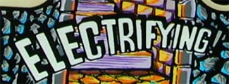
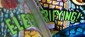
between sample and production games - glow in the dark parts, eyeball
shooter, boogie men extensions, and the RRR logo on the cabinet. But
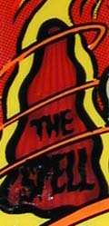
there are also quite a few differences in the playfield artwork
itself. Take a look at them below.
|
Production |
Sample |
|

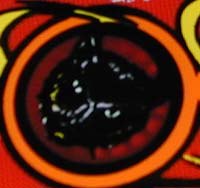
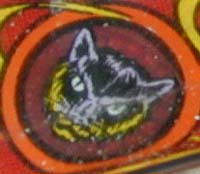
Cat target on the lower left of the playfield. |

The cat was much more defined on sample
games. Not quite sure why this was changed, other than maybe
they wanted it to look more like a black cat. |
|

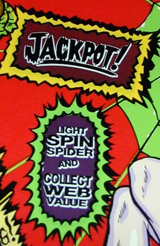
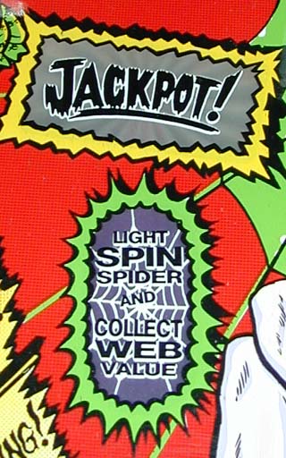
Entrance to the right ramp. |

The first thing you'll notice is the color on
the Jackpot insert. According to Cameron Silver, second
programmer on Scared Stiff - "It was white (clear) on the
proto games because initially that right ramp was used to re-light
the jackpot (and clear insert said "Relite Jackpot").
When we changed the rule, we scraped off the artwork and added the
bigger 'Jackpot' text. We were still stuck with a clear insert, so
we had to add the red condom to the bulb. I actually wanted
to change the other insert to a clear one and put the red bulb
under that, too .. But the rest of the team liked the red inserts
better (they DO light up better)"
The other difference is the appearance of a
spider web behind the "Spin Spider" insert. This
was removed as it was thought the web made it less readable. |
|

Pop Bumper area |

The green color was changed to white for better
readability and contrast. |
|

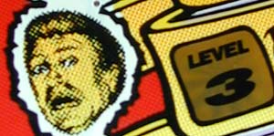
Level 3 on the Stiff-O-Meter |

Completely different face on the sample
games. I'd like to hear the reason this was changed ... |
|

Left outlane |

The "Saved By" was originally there
for the intended kickback. In fact, the cutout is still in
production aprons. But as the number of solenoids in the
game grew, the kickback itself had to be killed. The
autoplunger served the same purpose so it was used instead. |
|
